library(tidyverse)
library(palmerpenguins)

theme_set(theme_bw())
theme_update(axis.title = element_text(size = 24))


tuesdata <- tidytuesdayR::tt_load(2020, week = 28)
#>
#> Downloading file 1 of 1: `coffee_ratings.csv`Statistical Inference
a1 <- data.frame(
   x = c(2.5,3.5),
   y = c(41, 41),
   label = c("Yes", "No")
)

a2 <- data.frame(
   x = c(1.9),
   y = c(25, 35),
   label = c("False", "True")
)
a3 <- tibble(x = c(1.7,3),
             y = c(30, 43),
             label = c("H0", "Reject H0"))

yay <- tibble(x = c(2.5, 3.5),
              y = c(25, 35),
              label = c("Yay!", "Yay!"))

type1 <- tibble(x = c(2.5, 3.5),
                y = c(36.5, 26.5),
                label = c("Type I Error", "Type II Error"))

type2 <- tibble(x = c(3.5, 2.5),
                y = c(24.5, 34.5),
                label = c("beta", "alpha"))


# basic graph
p <- ggplot() + theme_void()

# Add rectangles
p + annotate("rect",
             xmin=c(2,3), xmax=c(3,4),
             ymin=c(20,20), ymax=c(30,30),
             alpha=0.2, color="green", fill="green") +
    annotate("rect",
             xmin=c(2,3), xmax=c(3,4),
             ymin=c(30,30), ymax=c(40,40),
             alpha=0.2, color="red", fill="red") +
    annotate("rect",
             xmin=c(3,2), xmax=c(4,3),
             ymin=c(30, 20), ymax=c(40, 30),
             alpha=0.8, color="royalblue", fill="royalblue") +
    geom_text(data=a1, aes(x=x, y=y, label=label),
             size=10 , fontface="bold" ) +
    geom_text(data=a3, aes(x=x, y=y, label=label),
             size=10 , fontface="bold.italic" ) +
    geom_text(data=a2, aes(x=x, y=y, label=label),
             size=10, angle = 90, fontface="bold" ) +
    geom_text(data=yay, aes(x=x, y=y, label=label),
             size=10, fontface="bold.italic" ) +
    geom_text(data=type1, aes(x=x, y=y, label=label),
             size=10, fontface="bold") +
    geom_text(data=type2, aes(x=x, y=y, label=label),
size=10, fontface="bold", parse = T ) x <- seq(-4, 4, length.out = 1000)
xx <- seq(-1, 7, length.out = 1000)
dt_one<-function(x){
y <- dnorm(x)
y[x < qnorm(.94)] <-NA
return(y)
}
dt_two<-function(x){
y <- dnorm(x, mean = 3)
y[x > 1.645] <-NA
return(y)
}
df1 <- tibble(x = x, y = dnorm(x))
df2 <- tibble(x = xx, y = dnorm(xx, mean = 3))
a1 <- tibble(x = c(0,3), y = c(0.43, 0.43), label = c("H0", "H1"))
a2 <- tibble(x = c(2.05,1.25), y = c(0.02, 0.02), label = c(paste("alpha"), "beta"))
df1 |>
ggplot(aes(x, y)) +
stat_function(fun = dt_one, geom = "area", fill = "red") +
geom_line() +
geom_line(aes(x, y), df2) +
stat_function(fun = dt_two, geom = "area", fill = "green") +
geom_vline(aes(xintercept = 1.645), lwd = 1.5) +
geom_text(data=a1, aes(x=x,y=y, label=label),
size=14 , fontface="bold.italic" ) +
geom_text(data=a2, aes(x=x,y=y, label=label),
size=10 , fontface="bold.italic", parse = T) +
theme_bw()x <- seq(-4, 4, length.out = 1000)
xx <- seq(-1, 7, length.out = 1000)
dt_one<-function(x){
y <- dnorm(x)
y[x < qnorm(.94)] <-NA
return(y)
}
dt_two<-function(x){
y <- dnorm(x, mean = 3)
y[x > 1.645] <-NA
return(y)
}
df1 <- tibble(x = x, y = dnorm(x))
df2 <- tibble(x = xx, y = dnorm(xx, mean = 3))
a1 <- tibble(x = c(0,3), y = c(0.43, 0.43), label = c("H0", "H1"))
a2 <- tibble(x = c(2.05,1.25), y = c(0.02, 0.02), label = c(paste("alpha"), "beta"))
df1 |>
ggplot(aes(x, y)) +
stat_function(fun = dt_one, geom = "area", fill = "red") +
geom_line() +
geom_line(aes(x, y), df2) +
stat_function(fun = dt_two, geom = "area", fill = "green") +
geom_vline(aes(xintercept = 1.645), lwd = 1.5) +
geom_text(data=a1, aes(x=x,y=y, label=label),
size=14 , fontface="bold.italic" ) +
geom_text(data=a2, aes(x=x,y=y, label=label),
size=10 , fontface="bold.italic", parse = T) +
theme_bw()alpha <- 0.05
cv <- qt(1-alpha/2, 23)
t_stat_sim <- function(i, mu){
x <- rnorm(24, mu, 3)
tt <- (mean(x) - 6)/(sd(x)/sqrt(24))
return(cv < abs(tt))
}
mus <- 0:12
powers <- c()
for(i in 1:13){
t_dist <- sapply(1:100000, t_stat_sim, mu = mus[i])
powers <- c(powers, mean(t_dist))
}
tibble(x = mus, y = powers) |>
ggplot(aes(x, y)) +
geom_line() +
ylab("Power") +
xlab("Alternative")penguins |> ggplot(aes(x = species, y = body_mass_g)) +
labs(x = "Species", y = "Body Mass") +
geom_jitter(aes(species, shuffle(body_mass_g))) +
geom_jitter(aes(species, shuffle(body_mass_g))) +
geom_jitter(aes(species, shuffle(body_mass_g))) +
geom_jitter(aes(species, shuffle(body_mass_g))) +
geom_jitter(aes(species, shuffle(body_mass_g))) +
geom_jitter(aes(species, shuffle(body_mass_g))) +
geom_jitter(aes(species, shuffle(body_mass_g))) +
geom_jitter(aes(species, shuffle(body_mass_g))) +
geom_jitter(aes(species, shuffle(body_mass_g))) +
geom_jitter(aes(species, shuffle(body_mass_g))) +
geom_jitter(col = "red") f_stat <- penguins |>
aov(body_mass_g ~ species, data = _) |>
anova() |>
_$`F value`[1]
f_sim <- function(i){
ff <- penguins |>
aov(shuffle(body_mass_g) ~ species, data = _) |>
anova() |>
_$`F value`[1]
return(ff)
}
f_dist <- replicate(10000, f_sim(1))
tibble(x= f_dist) |>
ggplot(aes(x, y = ..density..)) +
geom_histogram() +
geom_vline(xintercept = f_stat)#> [1] 9.999e-05Is there a linear relationship between flavor and aroma in coffee drinks from the coffee_aroma data set.
coffee_aroma |> ggplot() +
  geom_smooth(mapping = aes(aroma, flavor), method = "lm", se = F, col = "red") +
  geom_smooth(mapping = aes(aroma, shuffle(flavor)), method = "lm", se = F) +
  geom_smooth(mapping = aes(aroma, shuffle(flavor)), method = "lm", se = F) +
  geom_smooth(mapping = aes(aroma, shuffle(flavor)), method = "lm", se = F) +
  geom_smooth(mapping = aes(aroma, shuffle(flavor)), method = "lm", se = F) +
  geom_smooth(mapping = aes(aroma, shuffle(flavor)), method = "lm", se = F) +
  geom_smooth(mapping = aes(aroma, shuffle(flavor)), method = "lm", se = F) +
  geom_smooth(mapping = aes(aroma, shuffle(flavor)), method = "lm", se = F) +
  geom_smooth(mapping = aes(aroma, shuffle(flavor)), method = "lm", se = F) +
  geom_smooth(mapping = aes(aroma, shuffle(flavor)), method = "lm", se = F) +
  geom_smooth(mapping = aes(aroma, shuffle(flavor)), method = "lm", se = F) +
  geom_smooth(mapping = aes(aroma, shuffle(flavor)), method = "lm", se = F) +
  geom_smooth(mapping = aes(aroma, shuffle(flavor)), method = "lm", se = F) +
  geom_smooth(mapping = aes(aroma, shuffle(flavor)), method = "lm", se = F) +
  geom_smooth(mapping = aes(aroma, shuffle(flavor)), method = "lm", se = F) +
  geom_smooth(mapping = aes(aroma, shuffle(flavor)), method = "lm", se = F) +
  geom_smooth(mapping = aes(aroma, shuffle(flavor)), method = "lm", se = F) +
  geom_smooth(mapping = aes(aroma, shuffle(flavor)), method = "lm", se = F) +
  geom_smooth(mapping = aes(aroma, shuffle(flavor)), method = "lm", se = F) +
  geom_smooth(mapping = aes(aroma, shuffle(flavor)), method = "lm", se = F) +
  geom_smooth(mapping = aes(aroma, shuffle(flavor)), method = "lm", se = F) +
  geom_smooth(mapping = aes(aroma, shuffle(flavor)), method = "lm", se = F) +
  geom_smooth(mapping = aes(aroma, shuffle(flavor)), method = "lm", se = F) +
  geom_smooth(mapping = aes(aroma, shuffle(flavor)), method = "lm", se = F) +
  geom_smooth(mapping = aes(aroma, shuffle(flavor)), method = "lm", se = F) +
geom_smooth(mapping = aes(aroma, shuffle(flavor)), method = "lm", se = F) f_stat <- coffee_aroma |>
lm(flavor ~ aroma, data = _) |>
_$`coefficients`[2]
f_sim <- function(i){
ff <- coffee_aroma |>
lm(shuffle(flavor) ~ aroma, data = _) |>
_$`coefficients`[2]
return(ff)
}
f_dist <- replicate(10000, f_sim(1))
tibble(x= f_dist) |>
ggplot(aes(x, y = ..density..)) +
geom_histogram() +
geom_vline(xintercept = f_stat)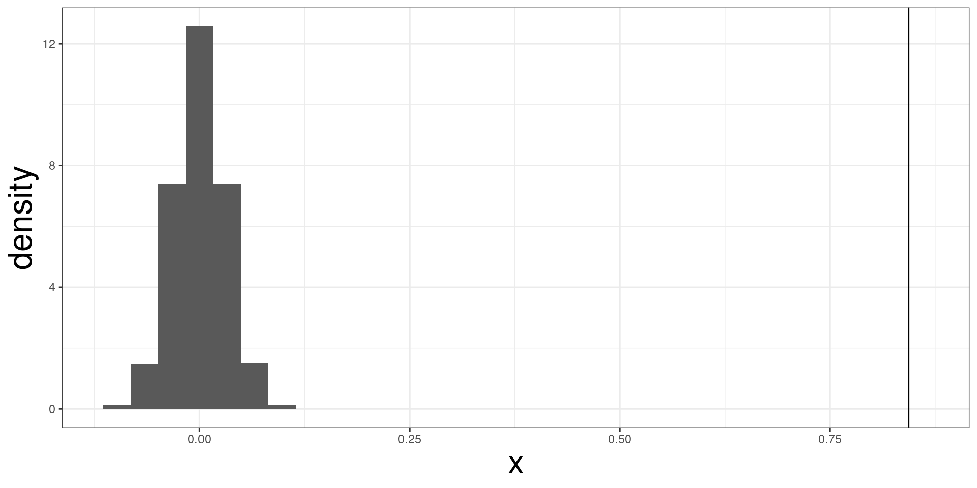
#> [1] 9.999e-05


